


In case you haven’t noticed, things look a little different around here. At our 2023 Annual Meeting, we were excited to announce our new name – the Alliance for Chemical Distribution (ACD) – along with the meaning and rationale behind the change. Our colors, our logos, and our imagery have also been updated, and each was strategically designed to support the new brand.
Today, ACD members impact every segment of the chemical supply chain, and we are more diverse than ever before. ACD engages with regulatory agencies and legislators to decide the future of our industry and works with suppliers, serves customers, and recruits potential members. It’s crucial that our creative brand strategy be simple, clear, and easy to understand in order to resonate with these audiences.
We also wanted our brand imagery to:
With these goals in mind, we carefully crafted our new visual identity to incorporate Motion, Performance, and Expertise. These are represented in the following design elements:
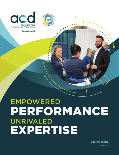
Motion – The powerful teal and chartreuse waves represent the ongoing movement within the industry – from the day-to-day work to the ever-changing needs of the industry we serve.
Performance – The lines, boxes, and dots around the photograph signify the very responsible, logistical, and operational precision our members achieve regularly to get products where they need to be.
Experts – The photos in our materials have changed to include fewer transportation-focused images and more people and products representing the work and industries our members serve.
Our new color palette of teal blues and chartreuse helps us stand apart from other associations within the chemical supply chain. Blues represent stability and professionalism. A hint of green in the chartreuse is included in honor of the move towards more sustainability throughout chemical distribution.
We hope that all of our members are as excited and motived as we are by the new imagery, and we encourage you to update and incorporate the new ACD and Responsible Distribution branding into your websites and other digital and printed materials no later than November 7, 2024. To help our members seamlessly transition to our new branding, we have put together a one-stop shop for all our official logos and branding materials. We are always available to assist members or answer questions, so please do not hesitate to reach out if we can be of assistance.
You must be logged in to post a comment.
